Explainers.

Microbiome 101

Thumbnail [100%x225]

Learn about what Guthub can do for you and get a brief introduction to all things microbiome, data processing, and paper-ready figures.

Relative Abundance Plots

Thumbnail [100%x225]

After learning about the microbiome, read about how to investigate the composition of your microbiome samples.

PCoA

Thumbnail [100%x225]

Learn to create a PCoA plot to distinguish different microbiomes.

PCoA Biplots New!

Thumbnail [100%x225]

Learn to create a PCoA with added arrows to showcase directional influence from most significant OTUs.

BF Ratios New!

Thumbnail [100%x225]

Read about the fundamentals behind BF Ratios.

LDA Plots

Thumbnail [100%x225]

Learn to a series of jitterplots for LDA values with the most significant OTUs.


Introduction for Beginners: Welcome to Guthub!

Guthub offers a simple, crisp interface to take your raw Mothur output files and turn them into paper-ready figures. Mothur is a data processing server hosted by the University of Michigan. Read more at Mothur.org. Guthub offers limited customization, but we try to meet the needs of all participating researchers. Expect regular updates to all Shiny apps!

Before we get into all of this, let’s take a step back and ask the fundamental question: What is the microbiome?


What is the Microbiome?

The microbiome is the summation of all the Bacteria and Archaea within any environmental context. This means there is a separate (though sometimes similar!) microbiome for our skin, our gut, our mouth, etc. These microbiomes are filled with a diverse community of Bacteria that intimately interact with our bodies in meaningful ways. Our microbiome can predict our risk of developing chronic diseases, like obesity, and Crohn’s Disease. Using a variety of data analyses, we can obtain some understanding on any given microbiome.


Closets, Closets, Closets.

Let’s explain this in easier terms. Say you have a closet filled with drawers. These drawers are filled with a variety of clothes. For most people, these drawers are disorganized. While they may be organized by type, they are not necessarily organized by color. For purposes of this explanation, let’s assume we can organize these drawers however we want instantly. We also have an infinite amount of drawers. Still with me?

Let’s start exploring our closet!

To get anything meaningful out of this exploration, we need to decide what clothes should go into what drawers. We can look at all of our clothes as a whole and look for patterns. Every closet is different. While one closet may have an abundance of pants, another might have no pants. Regardless of the contents of your closet, you could look at different types of clothes like pants or shirts. Additionally, you could look at different colors of clothes, like red and green. Finally, you could look at different ages of clothes, like date of purchase. The list goes on. types, colors, and ages are all variables, or attributes, of colors.

When we are satisfied with how we’re going to organize our clothes, we can place them into corresponding drawers. For starters, a drawer could be filled with all red clothes, all pants, or all red pants. It is completely arbitrary, but note how the contents of the drawer define what that drawer represents.

The drawer is the organizational unit of a closet, it’s what helps us break up all our clothes into categories we can understand and compare. An organizational unit can also be called a bin. (This is fitting considering drawers are basically bins!) A closet is a data set, consisting of different shelfs (i.e. bins) that can be described its contents (i.e. clothes) by different variables (i.e. attributes).

With any microbiome experiment, there are samples. Samples are the test subjects of your experiment (e.g. mice, humans, C. elegans). Rather than distinguishing between mice and humans, we’ll refer to both as samples for all purposes. In the context of our closet example, each closet is a sample.


Meaningful Analysis of your Data.

Now that we have an understanding of the organization of the closet, how can we analyze it to get meaningful results? First, we need a hypothesis. For example, let’s hypothesize that people with a higher percentage of red clothes tend to have a lower percentage green clothes. How should we analysis this? Do we just compare the total number of red clothes amongst our samples (i.e. our closets)? No. By doing this we are neglecting the relative size of the closet. What if someone has a large closet?

Closet 1
Red: 10
Green: 10

Closet 2
Red: 10
Green: 90

Comparing the closets above, both Closet 1 and Closet 2 have an equal number of red clothes. Had we not taken into account the size of the closets, we would have concluded the distribution of red clothes among both closets is the same!

Instead, to compare different samples, or closets, we need to look at relative abundances. By turning all our colors total into a percentage, we can get a relative look at our closets. This takes into account size of closets.

Closet 1
Red: 10
Green: 10

% Red: 10/20 = 0.5
% Green: 10/20 = 0.5

Closet 2
Red: 10
Green: 90

% Red: 10/100 = 0.1
% Green: 90/100 = 0.9

Now we can see a clear difference between the two closets! Of course, this data is not significant yet, because our number of samples, or N number, is 2. We’ll need access to more closet samples in order to conclude anything confidently. Additionally, if our closets below to different experimental groups, our N number will be affected.


Bringing it back Home.

So the closets scenario makes sense, but what does this have to do with the microbiome? Well, in a sense the microbiome is a type of closet. Each microbiome is filled with clothes, or different types of Bacteria. And each Bacteria has different attributes, like taxonomy_name and size.

Each microbiome is a sample. Each Bacteria, is referred as OTU, which represents a bin. Each bin might have a variety of attributes.

Let’s make things a little more complicated. Previously we described microbiomes through the perspective of its’ OTUs. Say we wanted to look at the microbiomes of our samples in terms of phylums, genuses, or domains (other levels of the taxonomy name), could we do this also? Of course! Here is the structure of taxonomy names, in case you aren’t familiar:

  • Kingdom
  • Phylum
  • Class
  • Order
  • Family
  • Genus
  • Species
  • Strain*

We can look at relative abundances of all attribute we have access to as long as it is adjusted for overall size within samples.

How the data set closets compare to the data set microbiome is listed below: $$Dataset \rightarrow Bins \rightarrow Attributes$$ $$Closet \rightarrow Clothes \rightarrow Types, \space Color, \space Age$$ $$Microbiome \rightarrow OTU \rightarrow taxonomy \_ name, \space size$$


Other Types of Data Analysis.

As seen previously, Relative Abundance Plots offer one perspective of the microbiome. But this data plot doesn’t tell us much. We can also look at the distribution of other types of attributes. Since we already looked at how different OTUs make up our samples’ microbiome, let’s dig deeper. We could look at the distribution of different attributes of a given species, given we have that information. Traditionally Mothur runs do not provide information on strains. The maximum amount of taxonomic specificity is Genus.

Now that you have been introduced to the microbiome and bioinformatics, take a look at any other data analysis explainer and start making figures today!

To get things started, here's a typical workflow for making microbiome figures: $$ PCoA \space plot \rightarrow AMOVA \rightarrow Relative \space Abundance \space Plot \rightarrow BF \space Ratio \rightarrow$$ $$Alpha \space Diversity \rightarrow LDA \space and \space LEFSe \rightarrow LDA \space Jitterplots \rightarrow Heatmap$$


The Bacteroidetes-to-Firmicutes Ratio.

After looking at relative abundances let’s start categorizing the microbiome a little more. One of the reasons to look at Relative Abundance Plots is to get a feel for how different phylum compare across samples. One example of this is the Bacteroidetes-to-Firmicutes Ratio. Bacteroidetes and Firmicutes are different phylum of Bacteria. Bacteroidetes is a phylum that has been shown to be associated with lean animals. Firmicutes is a phylum that has been shown to be associated with obese animals. By taking the Bacteroidetes amount and dividing it by the amount of Firmicutes Bacteria, we can get a crude ratio of obese risk.

$$BF \space Ratio = {{Total \space number \space of \space Bacteroidetes} \over {Total \space number \space of \space Firmicutes}}.$$ $${{\uparrow \space number \space of \space Bacteroidetes} \over {\downarrow \space number \space of \space Firmicutes}} = higher \space BF \space Ratio = Lower \space risk \space of \space obesity$$

If we take the total number of Bacteroidetes and Firmicutes bacteria and divide them, we can get a ratio for each sample. After averaging these ratios, they can be compared across different experimental groups.


Principle Coordinates Analysis (PCoA).

One of the first data analyses you should conduct on your microbiome data is the Principle Coordinates Analysis, or PCoA. This plot offers a two-dimensional spatial analyses of your samples. This data type is used to answer the question: Are these groups of microbiomes similar or different? This is the fundamental question when tackling any microbiome data. We’ll use Group 1 and Group 2 as our experimental groups for the remainder of this explanation.

What do we mean by “two-dimensional spatial analyses”? Well, the PCoA plot is similar in structure to an XY-plot you’re familiar with from grade school math. A PCoA plot is similar, but the axes names are the two most significantly different OTUs between your experimental groups. This gives you a framework to compare where the samples are clustering.

These plots provide two key pieces of information:

  1. How do samples within the same group cluster?
  2. How do samples within different groups cluster?

The above paragraphs are summarized in the PCoA plots below:

500x500

If samples within different groups cluster together, it is safe to conclude these groups have similar microbiomes. If samples within different groups cluster separate from each other, it is safe to conclude these groups have different microbiomes.

As can be seen in the PCoA plot above, we are looking at two experimental groups: Ctrl PN and Met PN. Don’t worry about what this means for now, what’s important are these axes labels and the relative spatial location of each dot (or microbiome). The X-axis has the label “Axis 1 (21.95%)”. This means that the most significantly OTU differs by 21.95%. The Y-axis has the label “Axis 2 (14.24%)”. This means that the second-most significant OTU differs by 14.24%.

Looking just at the Met PN samples, we see we have four samples. There is a significant spread of the Met PN samples, suggesting this microbiome type has a large amount of variation.

Looking just at the Ctrl PN samples, we see we have six samples. (Don’t worry if you can’t see them all! They’re there!) There is a significant spread of the Ctrl PN samples, suggesting this microbiome type has a large amount of variation as well.

When we compare both groups against each other, we see they have similar spreads. Thus, we cannot say if either group has a large or small variation, all we can say is they have the same variation. Remember, these spreads are relative because we are just comparing two groups without anything to reference to.

In addition to similar variations, we see both groups overlap almost perfectly. Thus, we can conclude that these two experimental groups have the same (or similar) microbiomes!


PCoA Biplots.

(Look at PCoA for a general overview of PCoA plots!)

To explain the concept of PCoA Biplots, we’ll use the PCoA plot below:

500x500

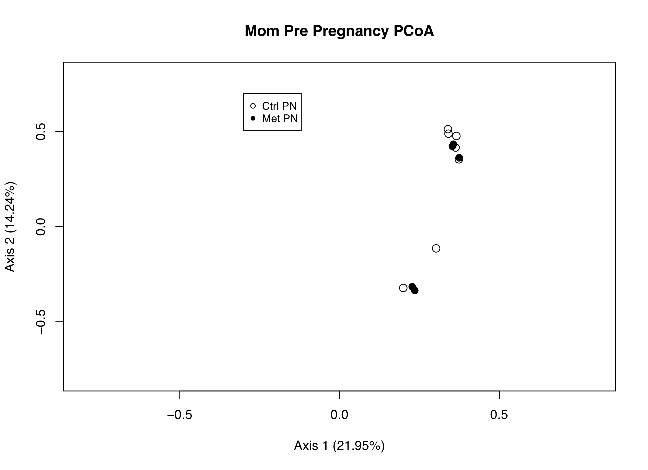
Initially, the PCoA plot suggests the two experimental groups, Met PN and Ctrl PN, have different microbiomes, considering the groups do not overlap. The spread within each group seem similar. Now that we know these microbiomes are different, our immediate question is: What makes these microbiota different?

To answer this, we can stay within our original PCoA plot. These microbiomes are different by virtue of the most significant OTUs observed. In other words, whatever OTUs differ the most amongst groups is what’s causing these microbiomes to not overlap. To see which OTUs are involved we can add biplot arrows. By displaying these biplot arrows we can see the OTUs represented as vectors. These vectors show which direction any given OTU is pushing the cluster(s).

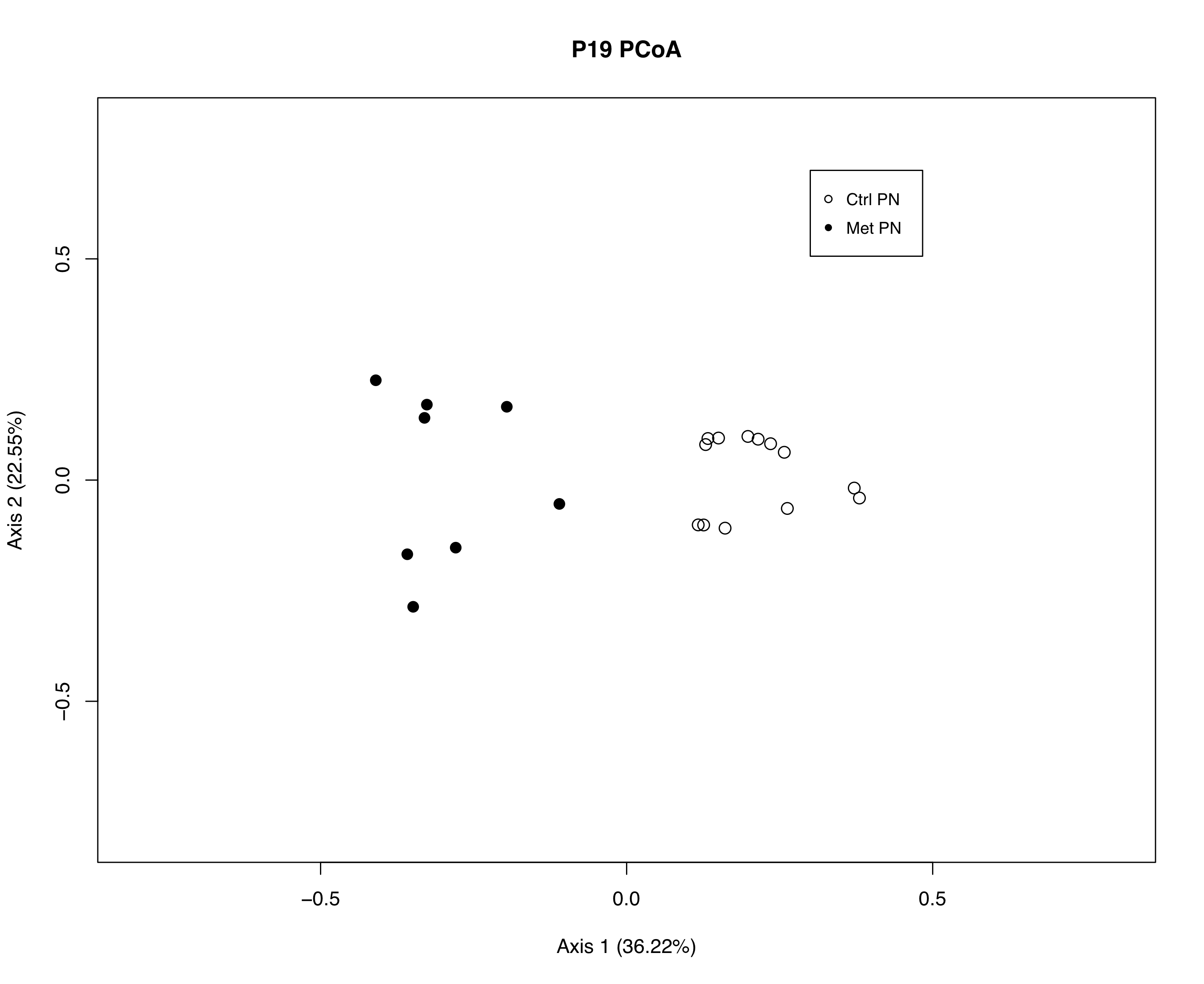
To better explain this, let’s see some biplot arrows in action! Let’s dig deeper into the above plot and see which OTUs are pushing Met PN and Ctrl PN to diverge. (Note: for sanity purposes, the PCoA and PCoA Biplot app are separate, so the plots will have different formatting) Take a look at the PCoA Biplot below:

500x500

While this plot looks different than our bare PCoA plot, it’s more similar than it may appear. Both experimental groups are the same, Met PN and Ctrl PN. Each experimental group has the same shape (Met PN has filled circle, Ctrl PN has open circle).

As stated above, the plots look different. This is because of two reasons that are specific to our coding. First, our PCoA and PCoA Biplot Shiny Apps are built separately, so the formatting isn’t exactly the same. Additionally, this plot example contains 6 additional Ctrl PN microbiomes (the 6 dots clustering at the bottom of the plot).

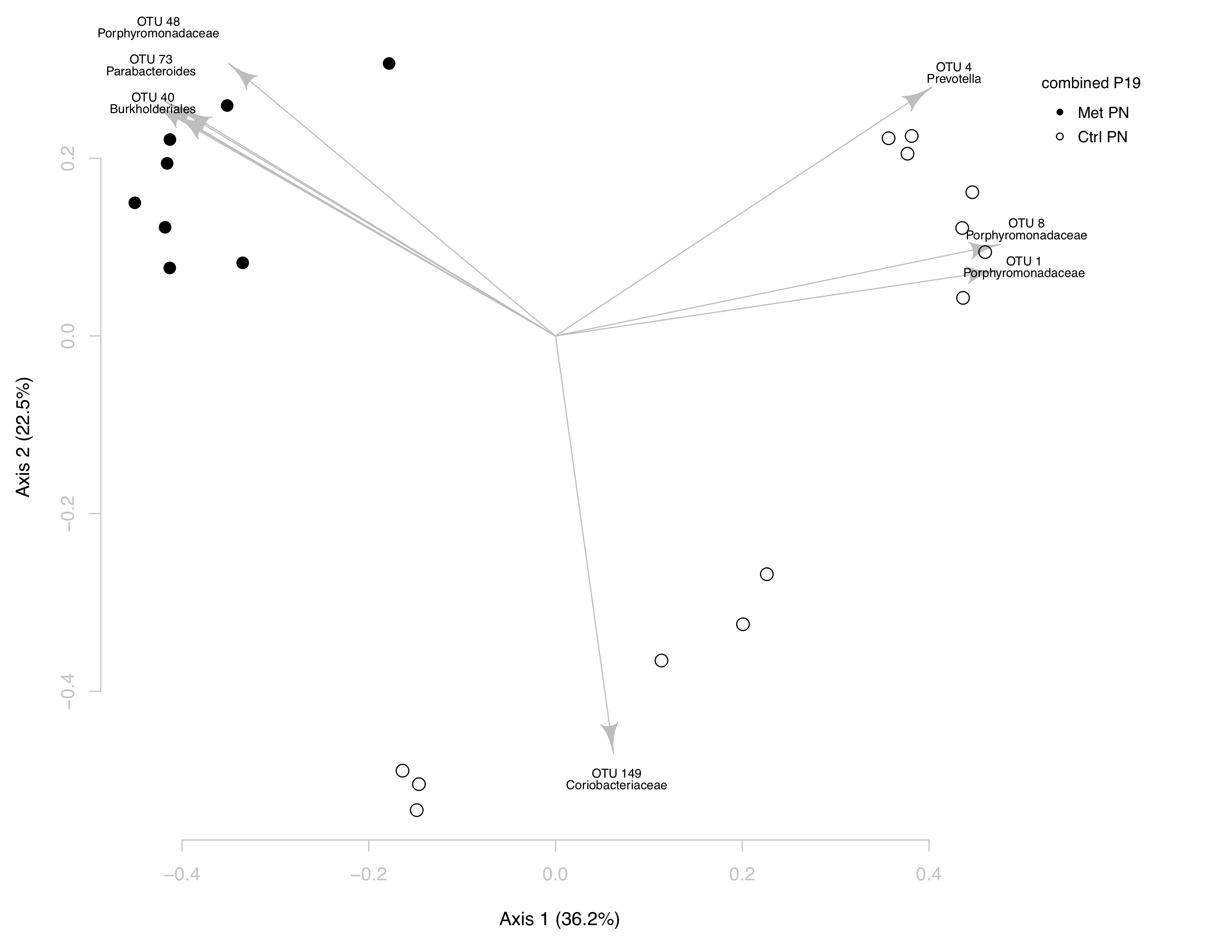
Now that we know what’s similar and different between the two plots, let’s start exploring our biplot! While it’s apparent the groups have different microbiomes in the bare plot, this biplot shows which OTUs are creating that difference.

In the upper left hand corner of the plot, it’s clear the Met PN samples are being changed by three OTUs: OTU 48, OTU 73, and OTU 40. These OTUs correspond to the genuses Porphyromonadaceae, Parabacteroides, and Burkholderiales, respectively.

When addressing the OTUs that are changing Ctrl PN relative to Met PN, there are two distinct shifts. First, is the cluster of Ctrl PN at the bottom of the plot, which is shifted by OTU 149, Coriobacteriaceae. Second, is the cluster of Ctrl PN at the upper right hand corner of the plot, which is shifted by three OTUs: OTU 1, OTU 4, and OTU 8. These OTUs correspond to the phyla Prevotella, Porphyromonadaceae, and Porphyromonoadaceae, respectively.

A hypothetical next step in data analysis would be to identify the points in Ctrl PN. It seems that within Ctrl PN, the microbiomes are separating into two distinct groups. Is this due to a protocol change? Are these two groups different cohorts of the same experiment? Are the two groups separating based on gender? The possibilities are endless!