Our Latest Shiny Apps.
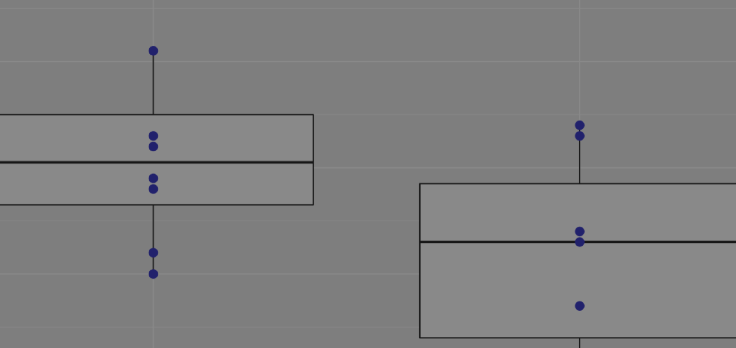
Abundance boxplots show the relative abundance of a single taxa element of bacteria.
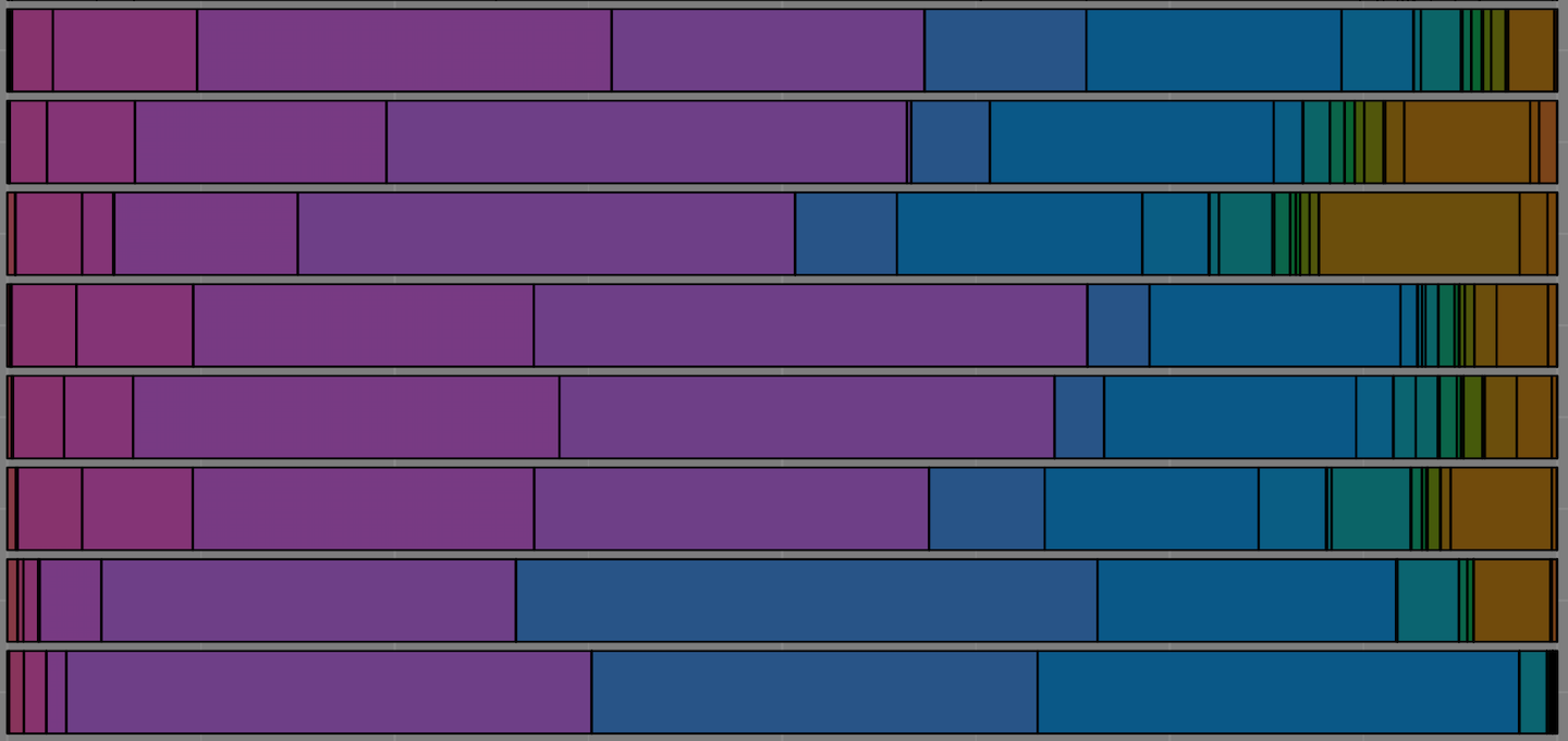
Abundance barplots show the total community relative abundances of bacteria in your samples.
Visualize your time-of-sac data from an Excel file.
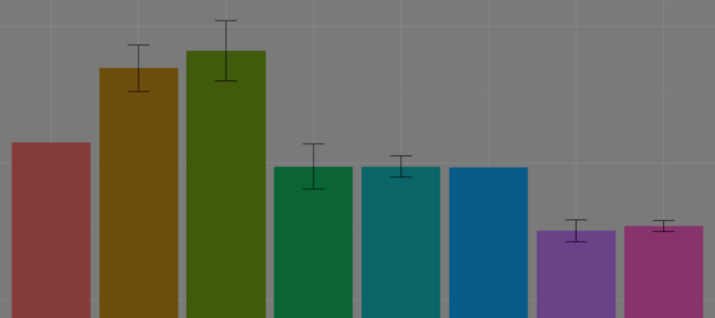
Alpha Diversity plots compare the number of species within a sample.
Get a ratio of the number of Bacteroidetes to Firmicutes within your samples.
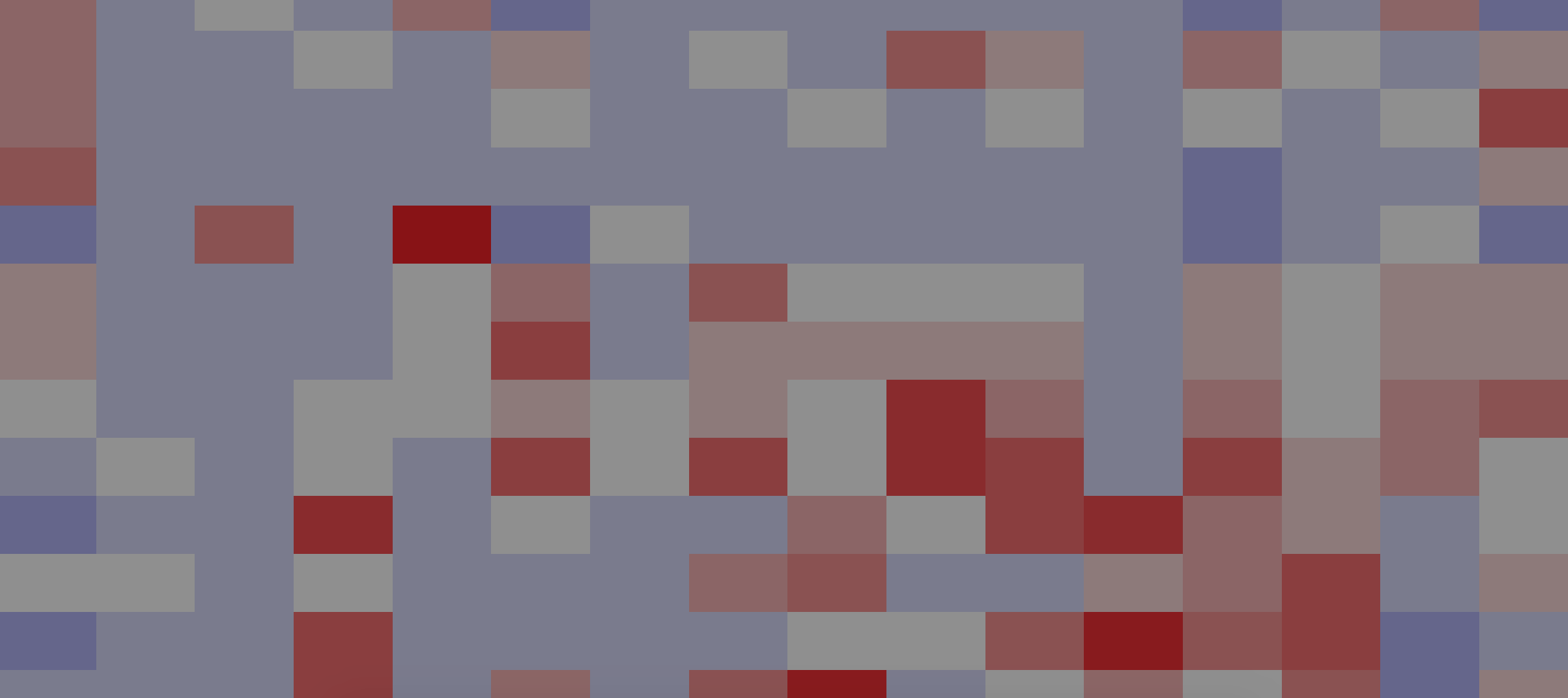
Create heatmaps to show relative abundance of the most significant OTUs.
Guthub is a data scientist's best friend. Bringing together fluxing with Mothur and data visualisation with R and Shiny apps, Guthub has everything you need to get your data faster. Guthub is a privately hosted website that's home to a variety of Shiny apps targetted at processing raw microbiome data from the Mothur fluxing program powered by the University of Michigan.
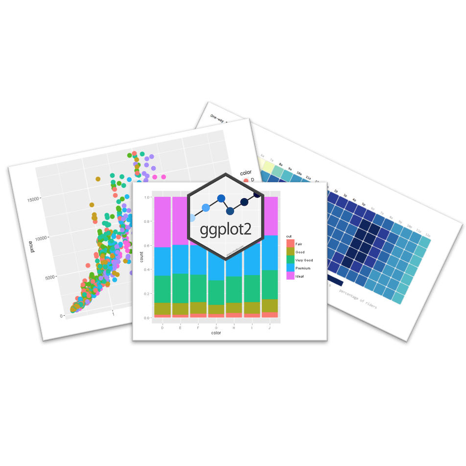
Guthub allows you to quickly produce ggplot2 figures. Rather than tweaking code every time you want to make a microbiome figure, use Guthub's Shiny Apps to effortlessly produce highly-customizable figures. Spend less time making figures. Spend less time editing code. Spend more time doing what matters to you.
Every time an R script is opened the likelihood of breaking the code grows. Completely eliminate the need to touch your R code by using Guthub's Shiny Apps. Upload any files needed, customize your figure, and export in any file extension faster and safer.
Let's face it: it's hard to learn R. On top of learning Mothur, data processing isn't as accessible as it should be. Consider an undergraduate research assistant: they have an interest in the microbiome, but are only staying in your lab for a year. Rather than spending time getting over the learning curve that comes with R, allow them to help process your data using Guthub. Everyone wins.